Although there are many facets to digital accessibility, this guide has been designed as an entry point for making a Canvas course more accessible. As you prepare to teach your next class, please keep these recommendations in mind. In addition to reviewing the information below, instructors and designers are also encouraged to visit Instructure’s Accessibility within Canvas Community page.
The Rich Content Editor
The Rich Content Editor in Canvas is where much of an instructor’s design work is completed, so it is important to understand the basic functions of this editor before delving into accessibility best practices. The embedded videos below will be helpful in getting started. The first explains the basic functions of the editor and the second demonstrates how to use its built-in accessibility checker.
Learn More
Review the following videos to increase your familiarity with the Rich Content Editor in Canvas.
- What is the Rich Content Editor (RCE)?
- How do I use the Accessibility Checker in the Rich Content Editor?
Rich Content Editor Tips
Using Headers and Lists

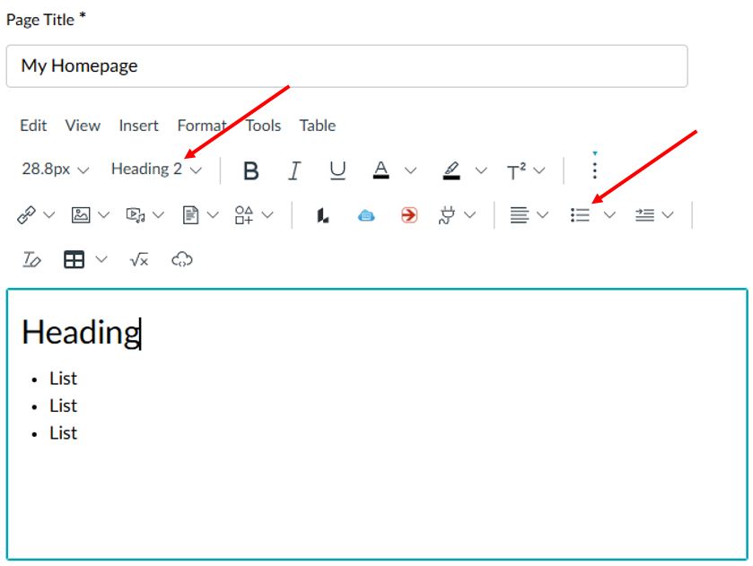
Chunking information rather than writing long paragraphs can make your content more digestible for all members of your class. For students who rely upon screen readers, however, the use of headings and lists is particularly important.
As you organize your information in the Rich Content Editor, add structure by using the Headings menu and the Ordered and Unordered Lists buttons.
Inserting Images
Adding images to a Canvas course can make it more visually appealing and provide cues as to what will be covered on a given page/section. In terms of accessibility, however, it is important to consider the role the images play in student learning. When uploading an image to a class, you will need to choose between one of the following options:
- Write Alt Text, which is a short description of what the image is depicting.
- Check a box that flags the picture as a Decorative Image.
These options are critical because they include image specific information that is picked up by screen readers. If an image is relevant to the curriculum of the course, Alt Text should be included so the student understands its relevance. On the other hand, images that have no significant academic value, but are present within the course, should be flagged as decorative. If neither option is applied, an accessibility issue has occurred!

When an image is being inserted, an Attributes section will be available before the process has been completed. This is the point at which either the Alt Text should be entered, or Decorative Image should be chosen.
Inserting Links
Adding links and hyperlinks to a course adds a great deal of value in terms of navigation and easy access to relevant resources. There is, however, an often-used practice that should be avoided, which is to use ‘click here’ as the text for the link. On the surface, it seems like a good idea, but it is an antiquated technique, which implies that only a mouse can be used to access the information.
The use of long URLs is also problematic because screen readers and text-to-speech applications will read every single character in the URL, which can be disorienting to a student. The Canvas Community website includes a guide for creating hyperlinks using the Rich Content Editor. When inserting a link, as shown in the guide, the link text should always be short and descriptive.
Checking for Accessibility Issues

The Canvas Rich Content Editor includes a built-in accessibility checker. It is located in the bottom right corner of the editor and has an icon of a circle containing a person with outstretched arms. If an accessibility issue is present, an icon of a blue circle containing the number of issues will appear. By selecting this icon, Canvas will identify the specific issues and provide guidance on correcting them.
Sharing Files
Uploading and sharing PowerPoint, Word, and perhaps Excel files in Canvas is a common practice, but there are a few steps that should be taken to ensure these documents are accessible. Below are a few resources for learning more and several specific tips, some of which are similar to the Canvas Rich Content Editor recommendations, to keep in mind as you develop your files.
Learn More
Review the following website to increase your knowledge of digital accessibility as it pertains to frequently used Microsoft 365 apps.
- Make your Word documents accessible to people with disabilities
- Make your PowerPoint presentations accessible to people with disabilities
- Accessibility best practices with Excel spreadsheets
Document Tips
- Choose widely available fonts, such as Calibri, Arial, Times New Roman, Helvetica, Courier New, and Verdana.
- Ensure that dark type is used on light backgrounds and vice versa. The accessibility of specific colors can be evaluated using an online contrast checker.
- Attempt to avoid using tables if possible. If it is necessary, use a simple table structure and include column headers.
- Use Microsoft’s built-in headings and styles.
- Include alt text with all graphics in the file.
- Use symbols or bold or italicized text to emphasize important information rather than color alone.
- Use descriptive hyperlinks rather than including the full URL or ‘click here’ when linking to a website from within the document. This video demonstrates how to create accessible links in Microsoft Word documents.
- Use Microsoft’s built-in accessibility checker to verify that the completed document is issue free.
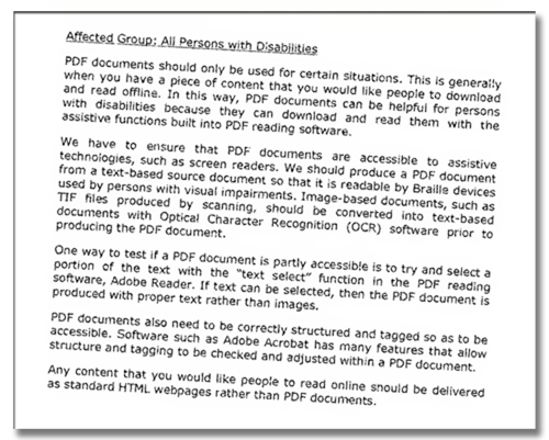
- If sharing the file as a PDF, be sure to save it as an accessible PDF.


